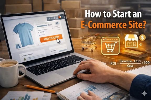
Converting visitors into customers is one of the most critical success metrics of an e-commerce website. Increasing traffic alone is not enough; the real issue is ensuring that users who visit the site add products to their cart, complete the payment steps, and finalize the purchase. The way to achieve this is by optimizing many factors together, from improving user experience and positioning trust signals correctly to page speed and simplifying the checkout process. In short, increasing the conversion rate requires a holistic strategy, and that strategy must consider both technical infrastructure and user psychology at the same time.
Many website owners focus on attracting more visitors by increasing their advertising budget, but improving the efficiency of existing traffic is far less costly. For example, increasing a 1% conversion rate to 2% means doubling sales with the same traffic volume. That is why details such as the quality of visuals on product pages, the persuasiveness of description texts, flawless mobile compatibility, and the number of fields in the checkout form are actually revenue levers. Every small improvement creates a serious compounding effect on total revenue.
Conversion optimization is not a one-time project, but a living process that requires continuous testing and measurement. A/B tests, heatmaps, user session recordings, and funnel analyses are the core tools of this process. Decisions should be made based on data, from which button color gets more clicks to where shipping information should be displayed on the page to reduce cart abandonment rates. Setting direction not by intuition but by real user behavior is the only reliable way to increase the conversion rate permanently.
An Example of an E-Commerce Page with a High Conversion Rate
Wireless Bluetooth Headphones, Active Noise Cancellation, 40-Hour Battery Life
6 installments of 216.50 TL per month
Color: Midnight Black
Trust Badges
Discount and best-seller labels strengthen the first impression and increase the click-through rate.
Social Proof
The number of reviews, rating, and sales volume build trust for the user.
Urgency Signal
Low stock and real-time interest information trigger faster decision-making.
Clear Price and Installment Information
Showing the installment option next to the price lowers the purchase barrier.
Prominent CTA Button
A contrasting color and large size make the add-to-cart step easier.
Shipping and Return Information
Emphasizing free shipping and unconditional returns reduces purchase anxiety.
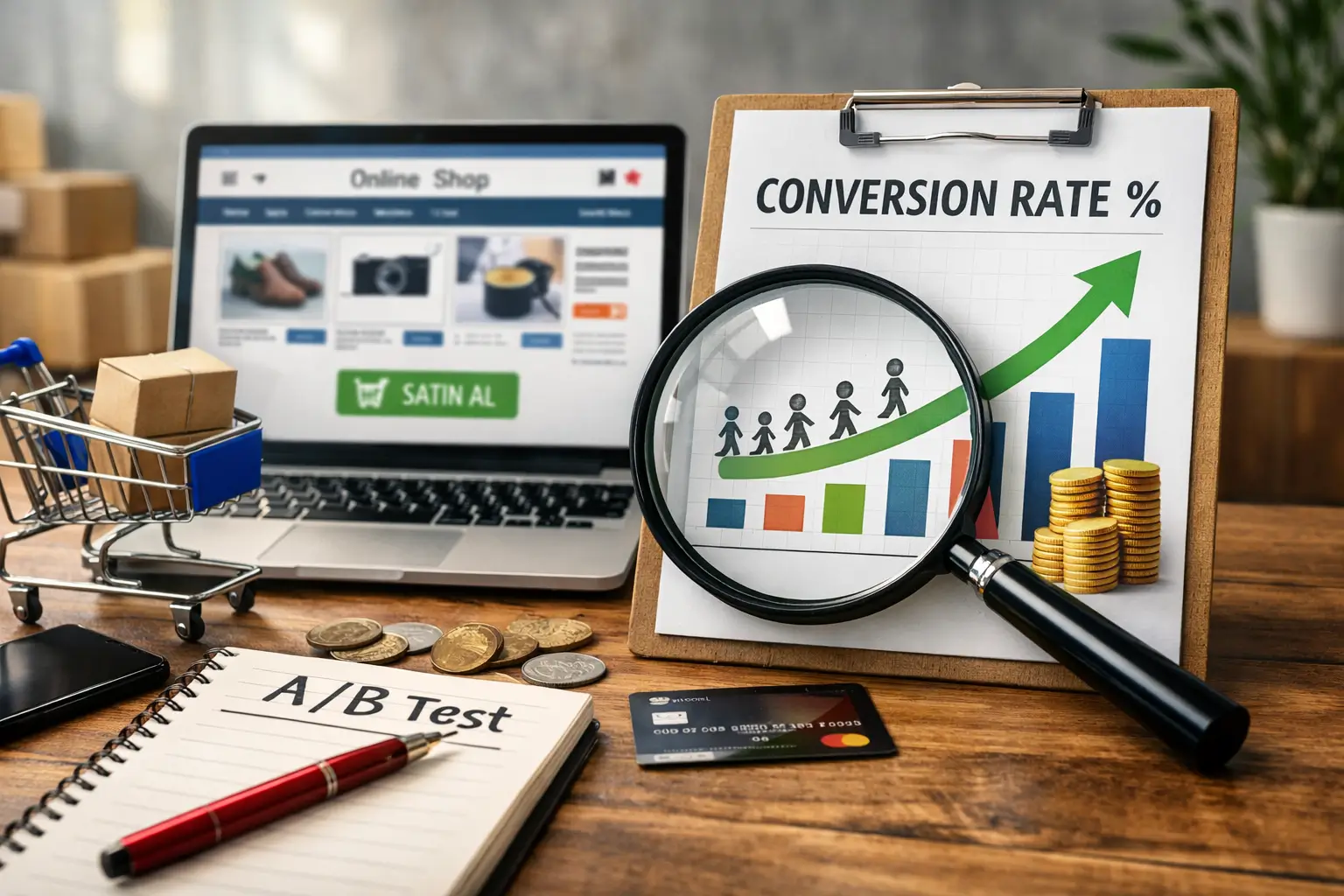
What Is Conversion Rate and Why Is It So Important?
Conversion rate refers to the percentage of users who visit a website and complete a specific goal. In e-commerce, this goal is usually a purchase. The calculation is quite simple: divide the number of sales made during a certain period by the total number of visitors during the same period and multiply by one hundred. For example, if your site gets 10,000 visitors in a month and 200 of them complete a purchase, your conversion rate is 2%. Although this figure varies depending on the industry, product type, and target audience, it offers a general benchmark.
This metric is one of the clearest indicators of the health of an e-commerce site. High traffic is certainly valuable, but if visitors leave without making a purchase, your advertising expenses are wasted. Tracking the conversion rate helps you understand whether your marketing budget is truly paying off. At the same time, it also reveals problematic points on the site: a low rate may indicate missing information on product pages, overly complicated checkout steps, or an inadequate mobile experience.
The real power of conversion rate lies in the major difference that small improvements create on revenue. Even increasing your current rate by half a point means a noticeable increase in turnover with the same number of visitors. That is why experienced e-commerce managers focus not only on growing traffic but also on getting maximum efficiency from the traffic they already have. Conversion rate is like a mirror that measures how well your site “sells,” and looking into that mirror regularly is a fundamental condition of sustainable growth.
Details That Increase Sales on Product Pages
When a user lands on a product page, their purchase decision takes shape within a few seconds. The quality of the visual, the persuasive power of the description, the way the price is presented, and the trust signals on the page directly affect this decision. A product page is actually a digital sales consultant; if it cannot answer the user’s questions or inspire confidence, the visitor leaves the page. That is why every detail must be designed consciously.
- High-Quality and Multiple Product Images: Users cannot touch the product in online shopping, so visuals are the biggest persuasion tool. Photos taken from different angles, zoomable, and preferably shown in a usage setting significantly increase the likelihood of purchase. If possible, adding short product videos also greatly reduces uncertainty in the user’s mind.
- Clear, Detailed, and Benefit-Focused Product Descriptions: Simply listing technical specifications is not enough. The user wants to understand how this product will benefit their own life. For example, instead of just writing the battery life of wireless headphones, saying “you can listen to music uninterrupted all day on a single charge” is much more effective. Descriptions that balance features and benefits guide the visitor toward the cart.
- Clear Pricing and Shipping Information: One of the most common reasons users abandon their cart is encountering surprise costs during checkout. Clearly showing the shipping fee, discount rate if any, and installment options next to the price on the product page is the fastest way to gain the user’s trust.
- User Reviews and Rating System: Evaluations left by real buyers are more convincing than any marketing text. Ratings visible on the product page, written reviews, and preferably photo-based feedback create powerful social proof that pushes hesitant users toward purchase.
- Stock Status and Urgency Signals: Information such as “Last 3 items” or “Ships today” creates an urge to act in the user. However, these signals must reflect reality; fake urgency messages may work in the short term but damage brand credibility in the long run.
- Easily Accessible Add-to-Cart Button: One of the most eye-catching elements in the page design should be the call-to-action button. Ensuring that the user can still reach the button while scrolling down, especially keeping it fixed on mobile, minimizes friction in the purchase process.
All these details may seem like small touches on their own, but when they work together, they create a noticeable difference in the conversion rate. Always evaluate your product page through the eyes of a customer: is there any lack of information, does it create a sense of trust, is the purchase step easy? When you answer these questions honestly and make the necessary improvements, it becomes possible to achieve much higher sales numbers with the same traffic volume.
Ways to Reduce Cart Abandonment Rate
The user likes the product, adds it to the cart, but closes the page before proceeding to checkout. This scenario is one of the most common and most frustrating problems of e-commerce websites. Research shows that the average cart abandonment rate in online shopping is above 70%. In other words, seven out of every ten people who add a product to the cart leave without completing the purchase. Although it is not possible to reduce this loss to zero, it is a very realistic goal to decrease it significantly with the right interventions.
- Eliminate Surprise Costs: The biggest trigger of cart abandonment is encountering unexpected shipping fees, taxes, or service charges during checkout. Clearly displaying all costs on the product page or at the latest in the cart summary allows the process to continue without damaging the user’s trust.
- Offer a Guest Checkout Option: A mandatory account creation step creates a serious barrier, especially for first-time visitors. Allowing users to place an order without creating an account greatly reduces friction in the checkout process. Offering account creation after the purchase is completed is a much more effective approach.
- Minimize Checkout Steps: Every extra form field and every additional page increases the likelihood of the user giving up. An ideal checkout flow gathers information entry on a single page and includes only truly necessary fields. Conveniences such as address autocomplete and saved card information make this process even faster.
- Add Different Payment Methods: Every user prefers a different payment method. Offering alternatives such as credit card, debit card, bank transfer, cash on delivery, and digital wallets together removes hesitation at the payment stage. Clearly showing installment options at this stage also noticeably increases conversion for high-value carts.
- Strengthen Trust Signals on the Checkout Page: Elements such as an SSL certificate, secure payment logos, and a privacy policy link ease the user’s concerns about entering card details. These details play a decisive role, especially for first-time shoppers.
- Send Cart Reminder Emails: A timely reminder email sent to users who abandoned their cart is one of the most effective ways to recover lost sales. Sending the first email within one hour of abandonment and the second one 24 hours later yields the best results. Including the product image from the cart and a direct link to the checkout page in the email significantly increases the return rate.
- Provide Live Support or Chatbot Integration: A user who leaves a question unanswered at the payment stage will most likely leave the page. Offering instant help with live support or a smart chatbot is the most practical way not to lose the user at that critical moment.
Reducing cart abandonment rate is not an issue that can be solved with a single move. Each of the steps listed above targets a different friction point in the purchase journey. The important thing is not to implement all these improvements at once, but to prioritize them based on data. When you examine your own website’s analytics reports, you can see exactly at which step users drop off and focus your intervention on that point. Every adjustment that may seem small will create a concrete increase in your cart-to-checkout conversion rate.
The Effect of Page Speed on Conversion
The loading time of an e-commerce website directly determines the visitor’s first impression. Every second that passes before the page opens erodes the user’s patience threshold a little more. According to data published by Google, when loading time increases from 1 second to 3 seconds, the bounce rate increases by 32%. When this time reaches 5 seconds, nearly half of visitors leave without even seeing the page. No matter how good the product is or how attractive the price may be, a slow-loading site does not even get the chance to show those advantages to the user.
Speed affects not only user experience but also search engine rankings directly. Since Google included Core Web Vitals metrics among ranking factors, page performance has become an inseparable part of SEO strategy. Indicators such as LCP (largest contentful paint), FID (first input delay), and CLS (cumulative layout shift) shape both organic visibility and user satisfaction. When a slow site starts falling in search results, traffic drops; when traffic drops, sales decline, and this vicious cycle grows deeper and deeper.
Investing in technical infrastructure is essential to improve page speed. Compressing images in modern formats such as WebP, cleaning unused CSS and JavaScript files, optimizing browser caching settings, and using a CDN (content delivery network) are the core steps of this process. On mobile, postponing the loading of below-the-fold images at page load with the lazy loading technique significantly increases perceived speed. Testing all these optimizations regularly with tools such as Google PageSpeed Insights and Lighthouse ensures that performance remains constantly under control.
How to Write an Effective CTA (Call to Action)
A CTA button is a short message that tells the user exactly what to do and encourages them to take action. Writing an effective call to action starts with putting the right word in the right place. Instead of vague expressions such as “Submit” or “Click,” texts that emphasize the benefit the user will gain achieve much higher click-through rates. For example, writing “Order Now, Delivered Tomorrow” instead of “Add to Cart” both creates urgency and offers a concrete promise. A good CTA should be able to answer the question “What do I gain if I do this?” in a single sentence.
Not only the content of the message but also its visual presentation directly affects conversion. The color of the button should stand out clearly from the rest of the page, its size should be large enough to tap comfortably on mobile, and its position should align with the user’s natural eye movement. Keeping the CTA button fixed at the bottom of the screen on long product pages ensures that the user does not miss the opportunity to take action even while scrolling down. In color selection, preferring tones that create contrast with the overall page design significantly increases the button’s visibility.
Using psychological triggers in CTA texts takes the conversion rate to the next level. Expressions that create a sense of urgency (“Last 2 Hours”), emphasize scarcity (“Limited Stock”), and reduce risk perception (“Try for Free, Cancel If You Don’t Like It”) accelerate the user’s decision-making process. However, it is very important that these triggers reflect reality; fake urgency messages may work in the short term but harm credibility in the long run. The healthiest approach is to compare different CTA variations through A/B tests and make the best-performing version permanent based on data.
How to Perform Conversion Funnel Analysis
A conversion funnel is a model that visualizes all the stages a user goes through from their first visit to the site until completing a purchase. Analyzing this model allows you to understand exactly at which step and why visitors drop off. When you create funnel reports in tools such as Google Analytics, you can clearly see the number of users at each stage and the transition rate to the next step. This allows you to act based on concrete data instead of intuition.
A typical e-commerce funnel consists of four main stages: visiting the homepage or category page, viewing the product page, adding to cart, and completing checkout. A certain rate of user loss occurs between each stage, and while these losses are completely normal, intervention is required when they exceed a certain threshold. For example, if the product page-to-cart transition rate is far below the industry average, the problem is most likely in the product descriptions, pricing, or visual quality.
Before starting funnel analysis, defining the correct goals and events is critically important. Recording each stage as an event in Google Analytics 4 ensures that data flows properly. When you configure events such as “page view,” “add to cart,” “begin checkout,” and “purchase” correctly, you can measure performance at each layer of the funnel separately. Incorrectly or incompletely defined events mislead analysis results and cause you to make wrong decisions.
When examining funnel reports, it is necessary to look not only at general numbers but also at breakdowns by segments. Funnel behavior may differ greatly between mobile and desktop users, organic traffic and ad-driven visitors, and new versus returning customers. For example, if the cart abandonment rate on mobile is noticeably higher than on desktop, the problem is most likely in the mobile payment experience. Such breakdowns help you focus your improvement efforts on the right point.
Funnel analysis is not a one-time report, but a process that is repeated regularly. Re-examining funnel data after every new campaign, design change, or price update reveals whether the change had a positive or negative effect. Evaluating qualitative data such as heatmaps and session recordings together with funnel figures makes it easier to understand the real user behavior behind the numbers. As long as you maintain this data-driven cycle, your conversion rate will increase steadily.


Do Comment